STEM was designed to be a platform where listeners can interact with music instead of passively playing it in the background.

Whether you are a casual listener, an audiophile, or a music industry professional, STEM offers a revolutionary music experience.

STEM was designed to be a platform where listeners can interact with music instead of passively playing it in the background.

Whether you are a casual listener, an audiophile, or a music industry professional, STEM offers a revolutionary music experience.

This project was part of a Google's UX Design training program where I earned my UX Design Professional Certificate.

I created this project from beginning to end. Therefore, I was responsible for everything from ideation, competitors research, and prototyping, to testing, conducting user research and refining the final product.

The initial goal was to combine features that already existed in other apps. These features served as inspiration and create the possibility for future collaborative partnerships.

My inspiration from existing platforms was as follows:

  • Platform: Music Streaming services such as Spotify and Apple Music

    • Features: listen to songs, search for albums, create playlists

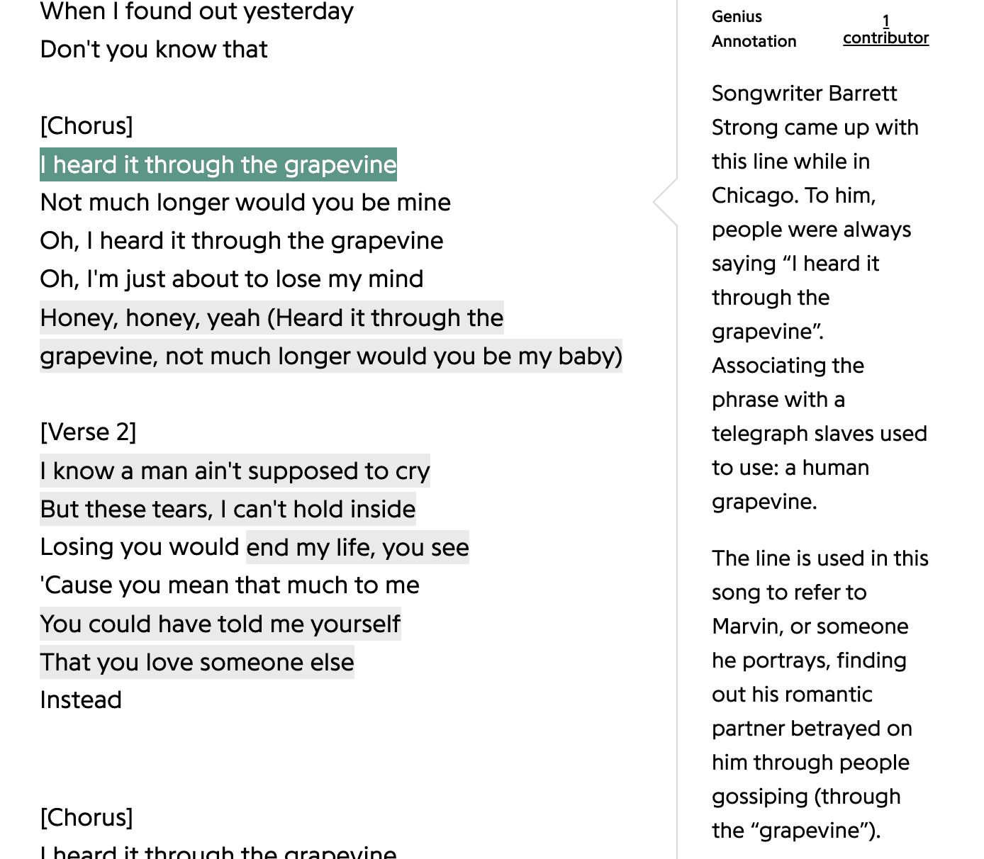
  • Platform: Genius

    • Features: song lyrics, credits


Users learn the meaning of the lyrics and the stories behind the production and the songwriting process.

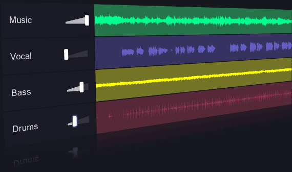
  • Platform: Moises, Splitter and Serato Sample

    • Features: extracting stems from songs, listening to separate elements of the song


Users can mute vocals, remove all instrumentals, or mix and match isolated track elements to create a pared down sound

  • Moises, Splitter and Serato Sample (extract stems from songs).

Listen separately different elements of the song.

For example, the user can mute the vocals, playing only the instrumental part of the music.

Or you can remove all the instruments, playing only the vocals with the drum or the guitar, among many other combinations. 

Challenges

One of the main challenges was to identify my target audience.

The average music streaming platform user simply wants to play songs and create playlists. Meanwhile, users interested in a deeper dive aren't necessarily familiar with music production structure and lingo.

Therefore, the app is intended for music professionals, as well as music fans who want to learn more about music through an interactive and immersive experience.

Research

(Usability Study)

To get an idea about which direction to take with regards to features and pages, I started my first usability test with the Low Fidelity Prototype pictured here:

From these results, I was able to identify the following pain points: 

  1. Users found it difficult to access features when they were scattered across different pages.


    To respond to this pain point, I adapted the page so that users could access songs, lyrics, and album credits, but also see which samples were used to create the song, and where the song was sampled elsewhere. Thus, users now had access to all features on the same page.

  2. Producers found that drum machine feature was not clean and intuitive.


    Although I wanted to add as many resources as possible, it was ultimately better to start with a simple design, then add a dropdown menu for additional effects and tools.

    This would also help the developers team to build a light, efficient app that runs smoothly, loads quickly and performs well across different devices.

REFINING

REFINING

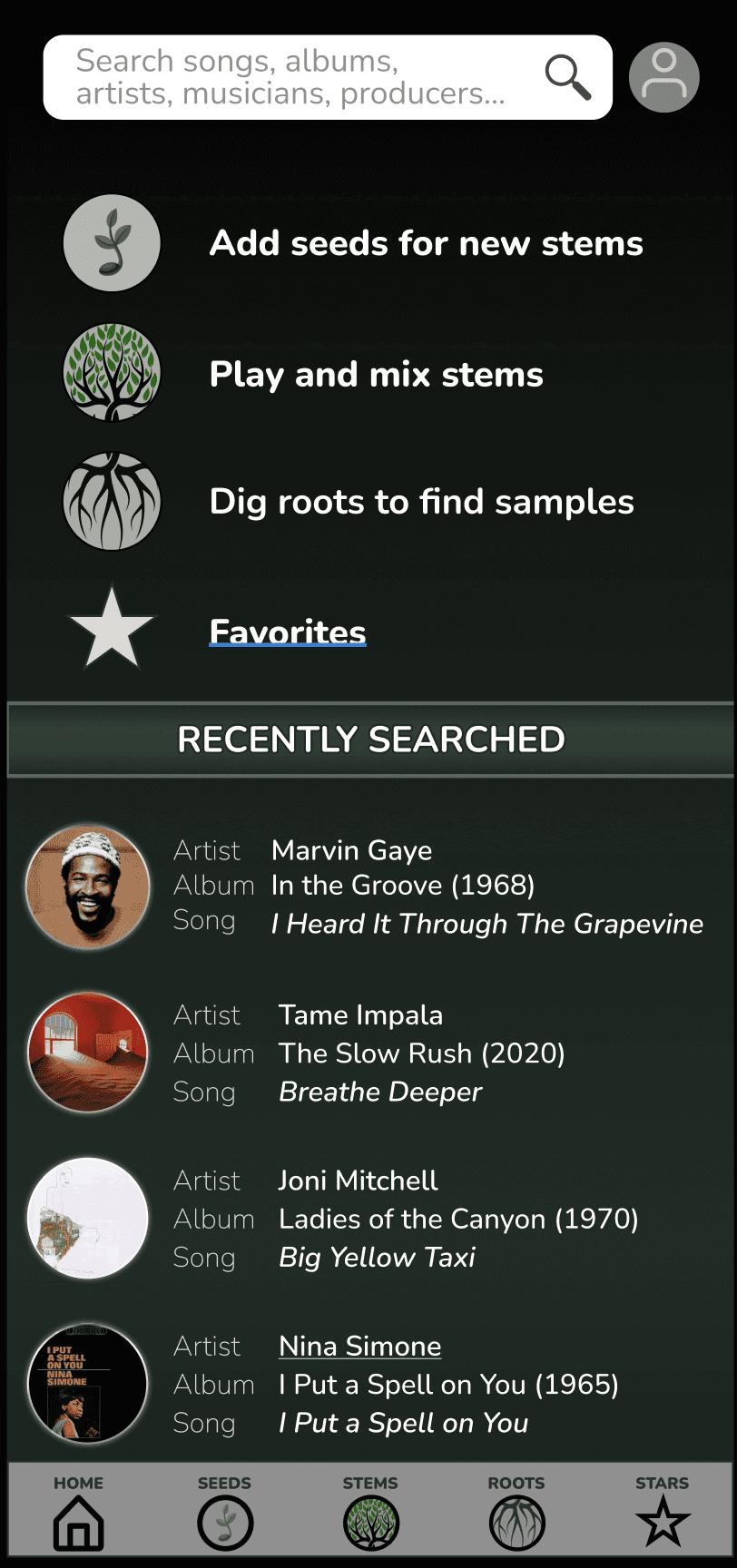
Finally, it was time to give the app a user-friendly interface by creating a High Fidelity Prototype and adding colors and images.

Finally, it was time to give the app an user-friendly interface, creating a High Fidelity Prototype,
adding colors and images.

Later on, during the second stage of the refining process, I changed the fonts, and added titles and descriptions to each section.

Later on, during a second stage of the refining process, I've changed the fonts, added title and descriptions for each section.

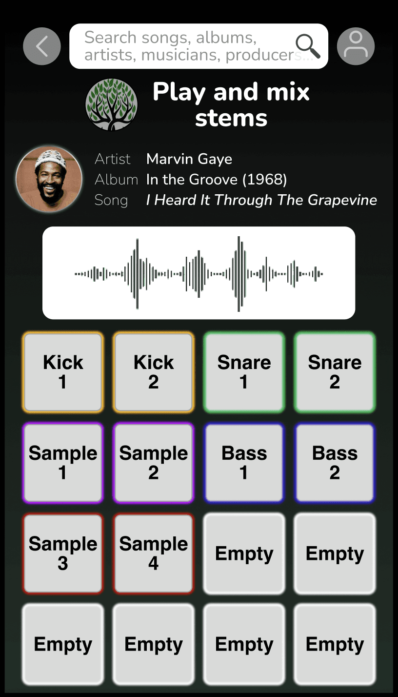
To more easily identify different elements and their labels, I added colors to the beat machine pads.

The second image shows the cleaner version, updated after testing.

To more easily identify different elements and their labels, I added colors to the beat machine pads.

The second image shows the cleaner version, updated after testing.

To easier identify different elements and their labels, I've added colors to the beat machine pads.
The second image shows a cleaner version after tests with the users.

I made the waveforms smaller, eliminated the artist image icon and added the option for the user to choose between dark or light for the pads, as shown in the video below.

I've made the waveforms smaller, eliminated the artist image icon and added the option for the user to choose between dark or light color for the pads, as it's possible to see in the video below.

I've made the waveforms smaller, eliminated the artist image icon and added the option for the user to choose between dark or light color for the pads, as it's possible to see in the video below.

In the first design, the artist page was cluttered.

The interface needed to be cleaner and more readable.

By changing the font and increasing the gap between elements, I was able to improve user navigation.

Additional elements helped to improve the interface and the page hierarchy, such as:

- larger album covers
- ascent color to highlight buttons
- dropdown menus where users can filter results
- an arrow to scroll down to the next song

Below is an extended version of the page after scrolling down:

Other elements helped to improve the interface and the page hierarchy, such as the bigger album cover, an ascent color to highlight the button, a dropdown menu where the user could filter the result and an arrow to scroll down to the next song.


(This is an extended version of the page after scrolling down)

CONCLUSION
and
FOLLOW UP

The market still needs a truly comprehensive music app that functions not only as a simple media player, but that also gives users access to the entire scope of a song, including detailed credits, samples, isolated tracks, and lore behind lyrics and composition. STEM is that app.

In order to place STEM at the forefront of the music app market, the next step is to establish partnerships with other platforms. By offering integrated services and improving the database, STEM will become the app of choice for music professionals and enthusiasts alike.


As STEM grows, the ultimate challenge will be to maintain a simplified interface for novice users, while also offering the complexity that music professionals need.


A/B testing will be crucial to identifying potential problems, and analyzing which features are most popular among users. This data will ultimately determine the future of STEM.