
Joseph Saddler High School (New York)
As a generalist UX Designer, my role included tasks such as user research, ideation, prototyping, testing, iterating and delivering the final product. This was part of a professional training designed by Google where I earned my UX Design Certificate.
The objective was to create a webpage and a mobile app for a hypothetical school in New York City, helping students, teachers and counselors improve communication, optimize time and organize their schedules.
Among many features, the students can use the app to get information about courses, college credits classes, programs and study resources.
Challenges
Find a seamless way for students organize their schedules.
Provide to students structured information about classes, universities and where to find studying resources.
Create a intuitive chat feature where students and counselors can talk to each other.
Research
(Usability Study)
During my research, I've identified new pain points:
Users wanted a clear way to save the page, like an ‘Add to Favorite’ feature. They mentioned that the heart feature should appear on the list page thumbnails, not only in the course page.
It was confusing to set up an account. They also wanted to be able to search freely and explore the app or webpage before setting up an account to have personalized tips and suggestions.
Many users wanted to contact a counselor but couldn't find the chat feature. They felt the need for a clear way to contact a counselor, without having to click on additional menus and pages.
School counselors took too long to reply to students and spent too much time talking to each student individually.

Although the webpage and the mobile app were structured simultaneously, during the ideation and research phase the refining started with the desktop version.
I made the following changed to respond to user pain points:
I replaced the burger menu with a traditional navigation menu.
I added colors and images, as well as the icons.
I completely rearranged the homepage, using a cleaner layout and a carrousel menu.
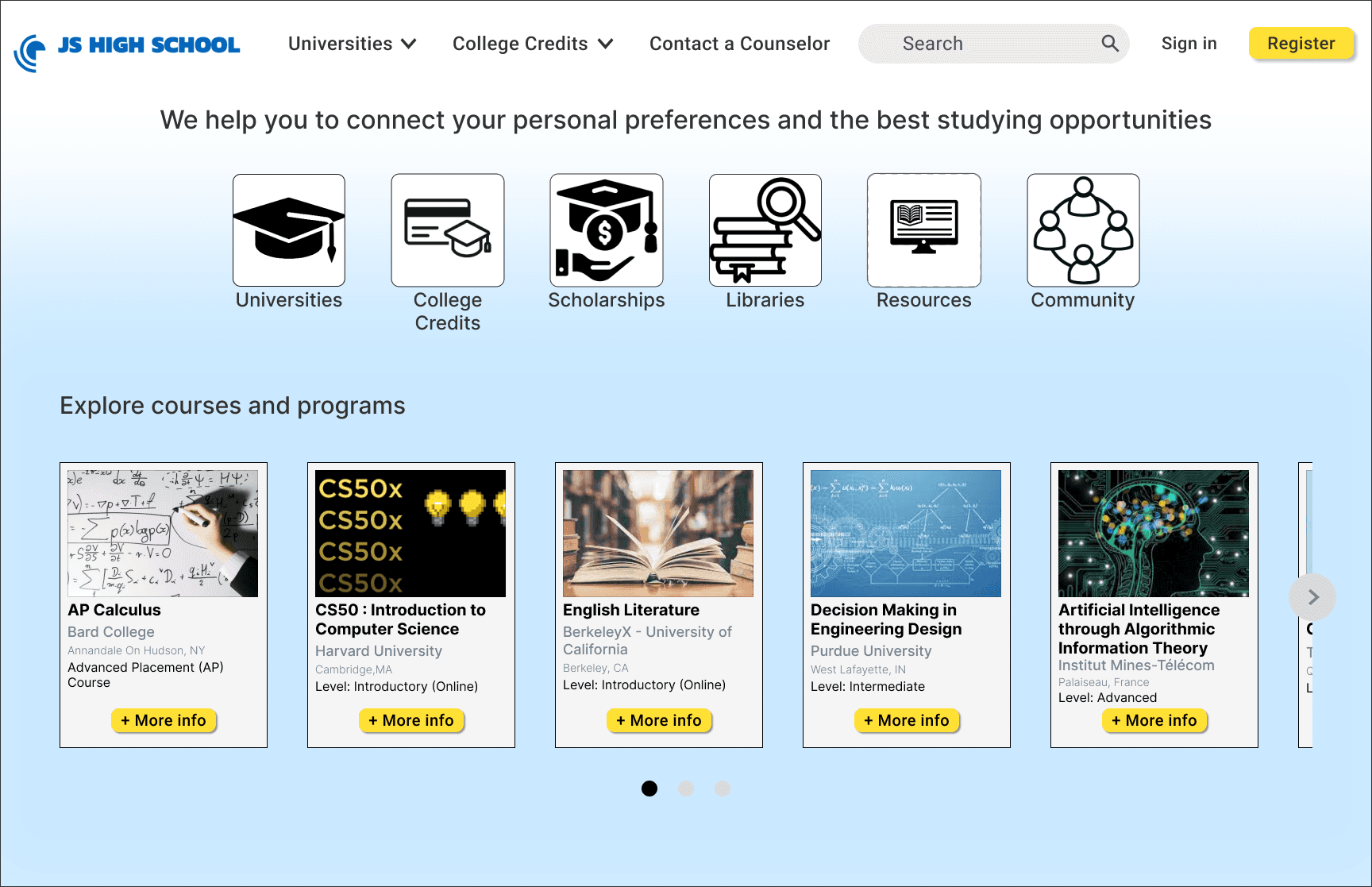
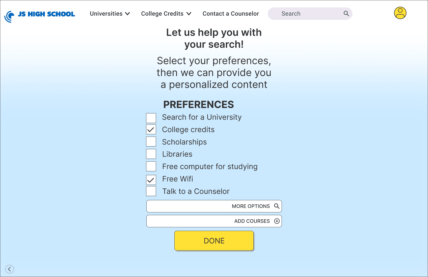
At first, the user would need to go through two screens to finally access the profile and search for content.
To simplify this process, I merged both screens into one, decreasing the number of clicks and improving the overall experience.
BEFORE
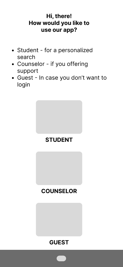
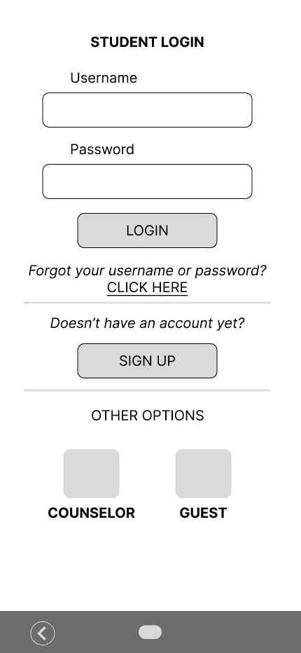
AFTER

On the 'profile preferences' page, I added a search bar to the top, and removed a text box containing redundant information.
BEFORE
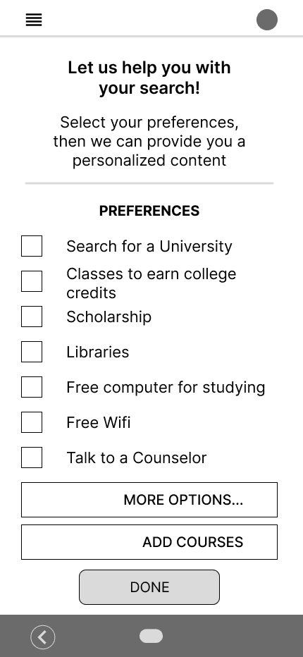
AFTER

The next step was to add icons to each section and a feature to contact a counselor. This made communication among users more intuitive, and reduced the number of clicks.
BEFORE
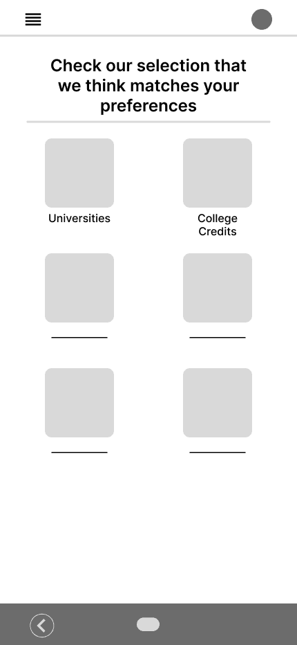
AFTER

When searching for "history courses", for example, I designed the results list page with thumbnails illustrating each class, as well as a preview of the class description.
BEFORE
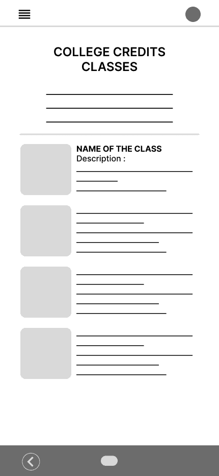
AFTER

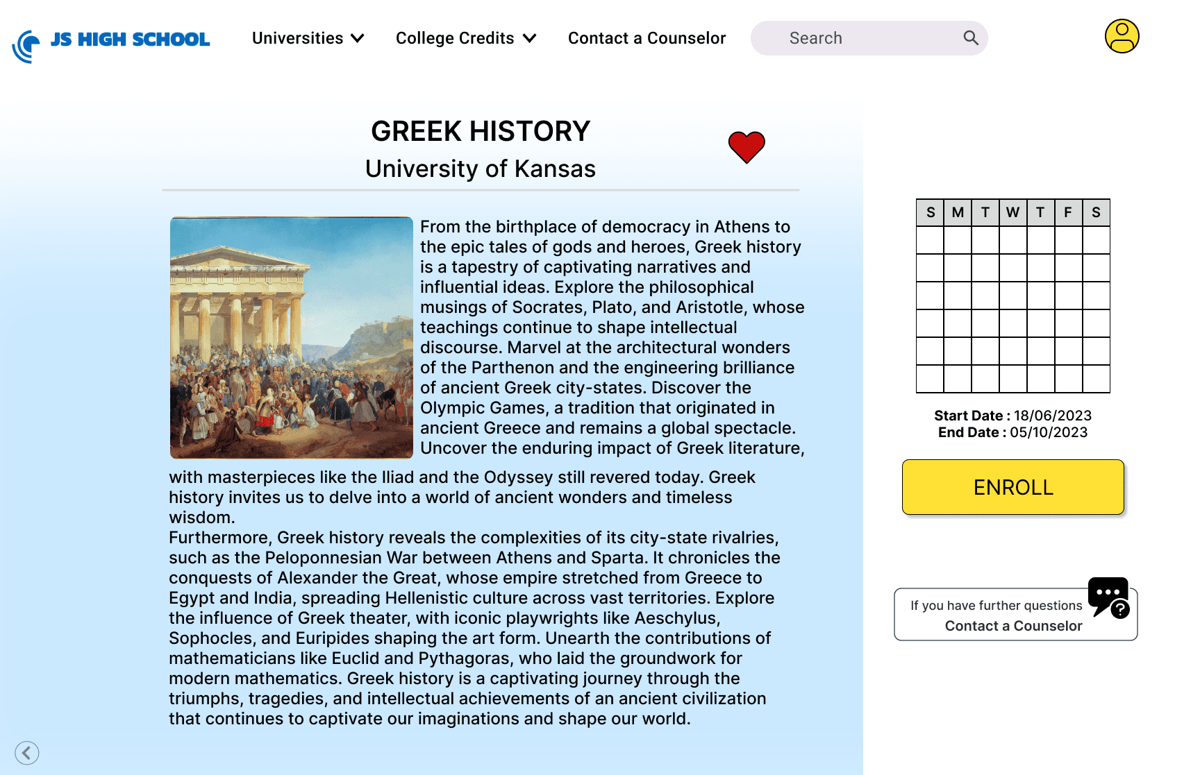
By accessing the class pages, the user can see brief descriptions and check the availability of dates.
BEFORE
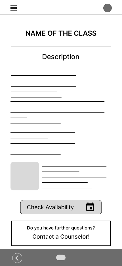
AFTER

Instead of loading a new page to choose the dates, as previously designed, now an overlay menu appears and the users can choose dates while still in the class page. This helps users double check information before enrolling in the class.
BEFORE
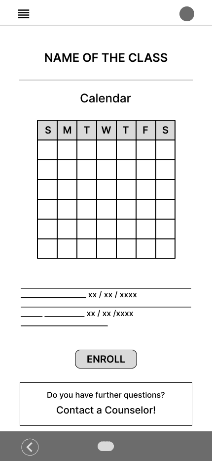
AFTER

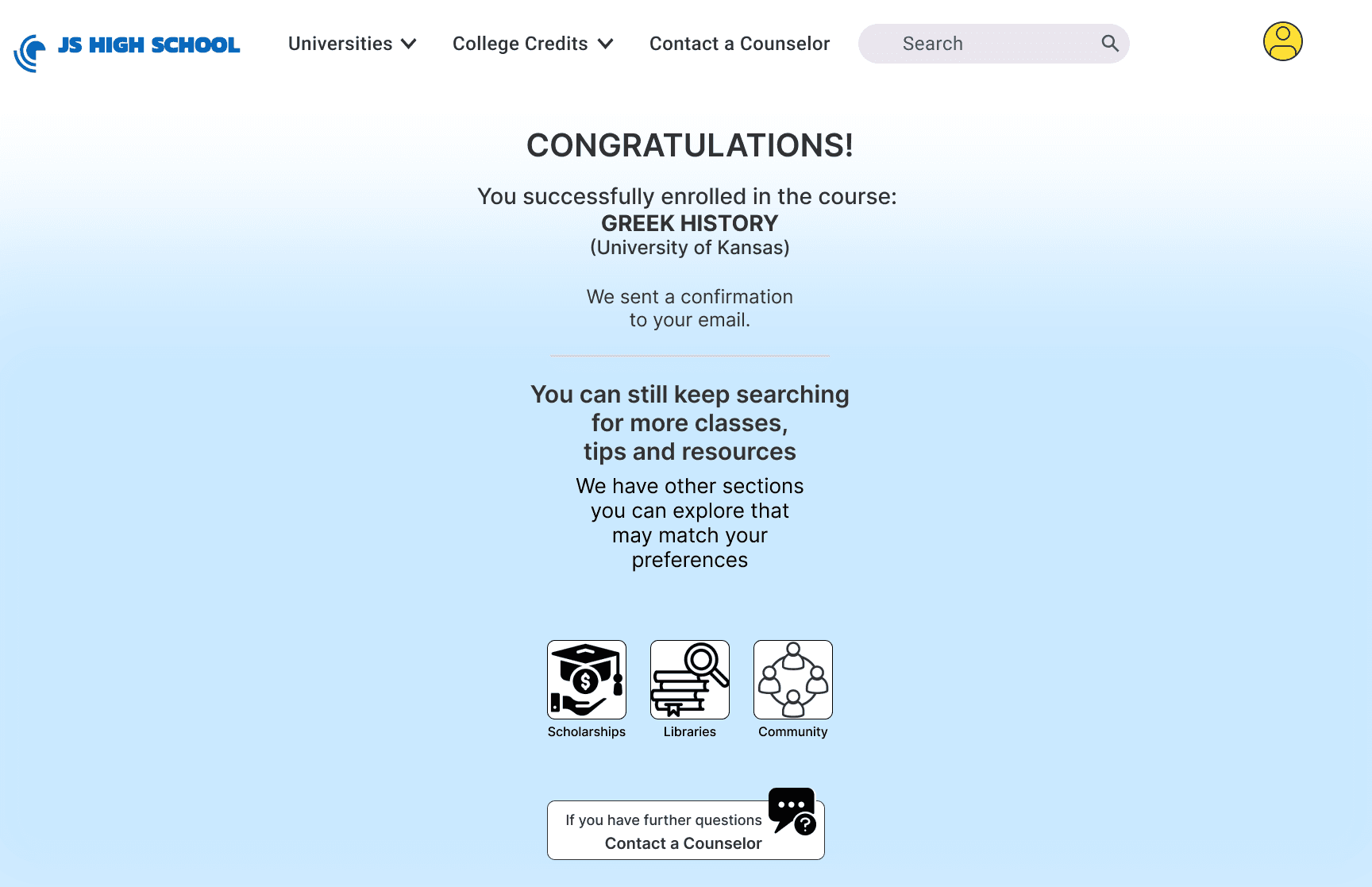
The confirmation page was almost defined when I first tested the app.
I only needed to add icons that linked to other sections of the app in order to keep the user exploring some other app features.
BEFORE
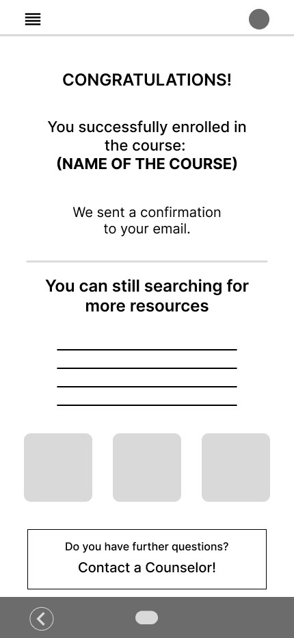
AFTER


